01
Hierarchy
Private wealth advisory styling enforces restrained typography and deliberate spacing throughout every interface segment.
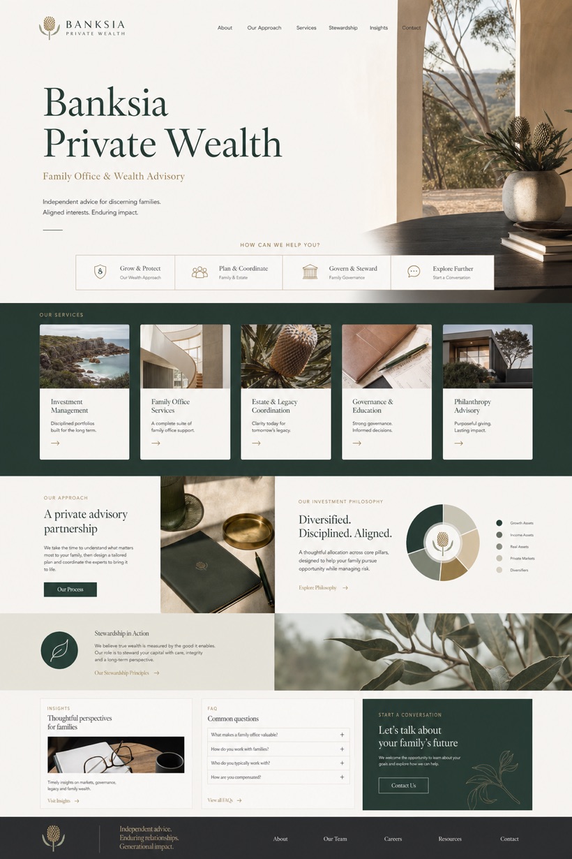
This fictional Australian wealth management showcase emphasizes a private wealth advisory tone supported by balanced mastheads and structured navigation cards.
Design reading
Fictional Australian family office and wealth advisory website concept with calm service cards, stewardship copy, and inquiry flow. The conceptual framework employs a private wealth advisory style utilizing eucalyptus brass and graphite tones for sophisticated visual balance. A balanced masthead selector introduces portfolio categories before descending into a service card advisory grid that organizes detailed stewardship messaging and conversation requests for accurate platform routing.
Independent fictional concept study; not client work or a live business.
Information and action
The notes explain the intended function of the concept rather than presenting the fictional brand as a client or live organisation.
01
Private wealth advisory styling enforces restrained typography and deliberate spacing throughout every interface segment.
02
Service card advisory grid structures complex financial offerings into clearly defined categorical blocks.
03
Eucalyptus brass graphite color strategy establishes institutional credibility while supporting the balanced masthead selector layout.
Responsive thinking
The long presentation image is a showcase artefact. A live project would be rebuilt as responsive HTML rather than served as one tall image.
Mobile / 01
Horizontal scroll zones convert to vertical stacks on handheld displays to preserve card legibility and spacing.
Mobile / 02
Selector toggles reposition centrally along the viewport edge for effortless thumb reach during mobile sessions.
Delivery
Content, images and actions would be separated into accessible page components, with real text and controls at every viewport.
Finance
Compare how the same industry can use different hierarchy, imagery and inquiry structures without repeating one template.