01
Hierarchy
Editorial design establishes a refined reading experience tailored for property exploration across distinct spatial sections.
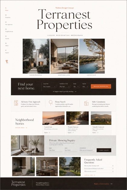
This fictional website concept showcases high end residential development through an editorial layout, utilizing full bleed chapter navigation paired with captioned imagery.
Design reading
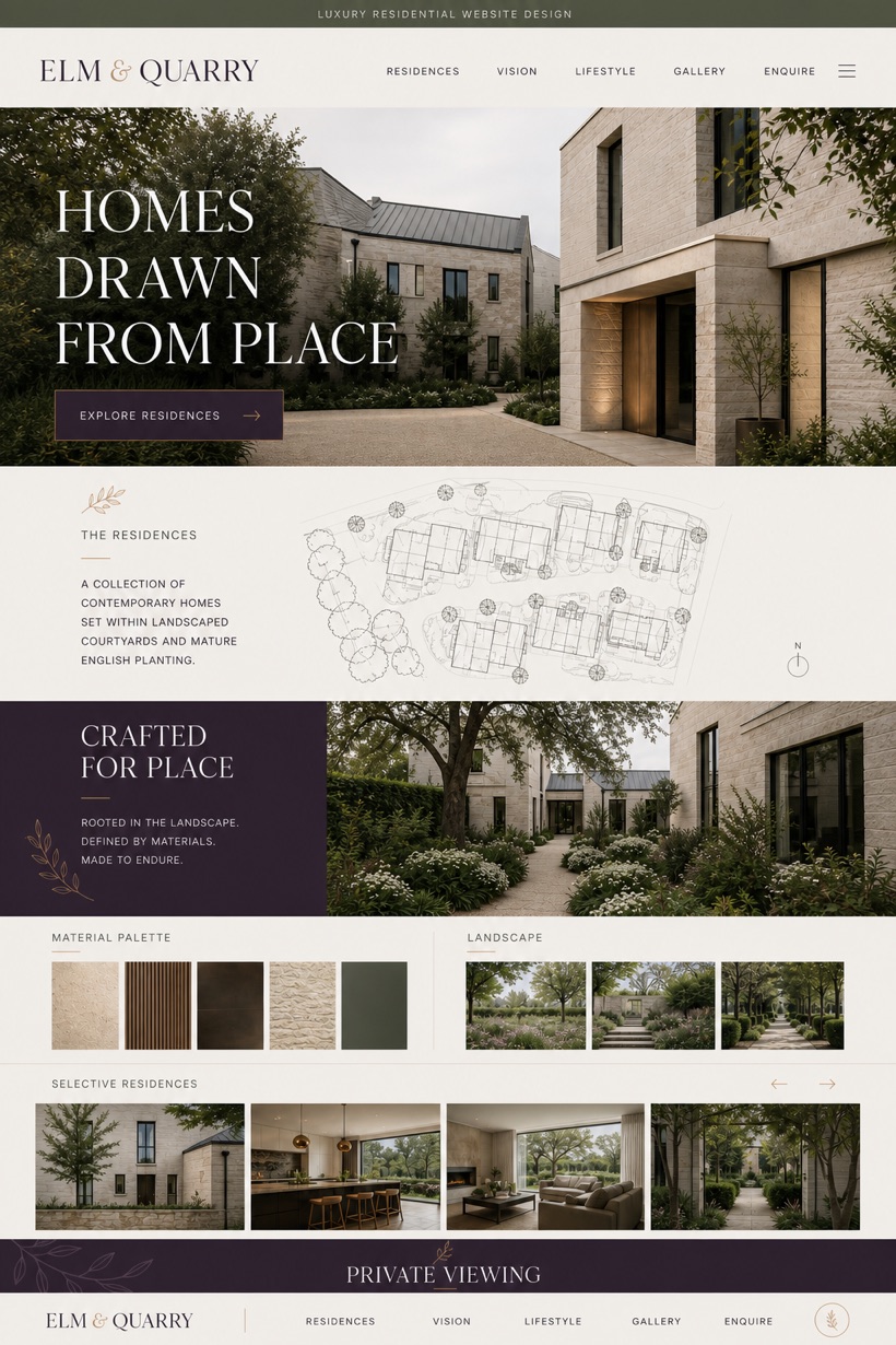
Elm & Quarry is a fictional high-end residential development website concept. The project explores a creative approach to showcasing property developments online. A structured editorial framework guides visitors through distinct spatial sections. Full bleed imagery anchors each chapter while maintaining consistent typographic hierarchy. The selected color strategy relies on neutral material tones to reflect architectural finishes and natural textures throughout the interface.
Independent fictional concept study; not client work or a live business.
Information and action
The notes explain the intended function of the concept rather than presenting the fictional brand as a client or live organisation.
01
Editorial design establishes a refined reading experience tailored for property exploration across distinct spatial sections.
02
Full bleed chapters organize content sequentially while preserving wide aspect ratios for structural photography and landscape views.
03
Material tone range selects neutral hues inspired by stone and timber finishes to maintain visual consistency.
Responsive thinking
The long presentation image is a showcase artefact. A live project would be rebuilt as responsive HTML rather than served as one tall image.
Mobile / 01
Vertical stacking ensures readable typography and accessible navigation across smaller display dimensions.
Mobile / 02
Responsive image scaling maintains aspect ratio integrity while preserving touch target spacing.
Delivery
Content, images and actions would be separated into accessible page components, with real text and controls at every viewport.
Property
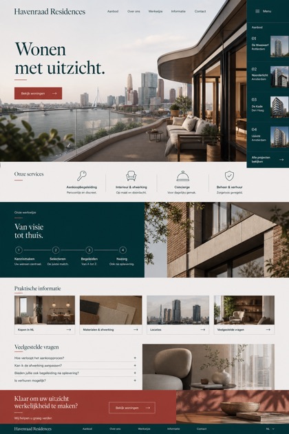
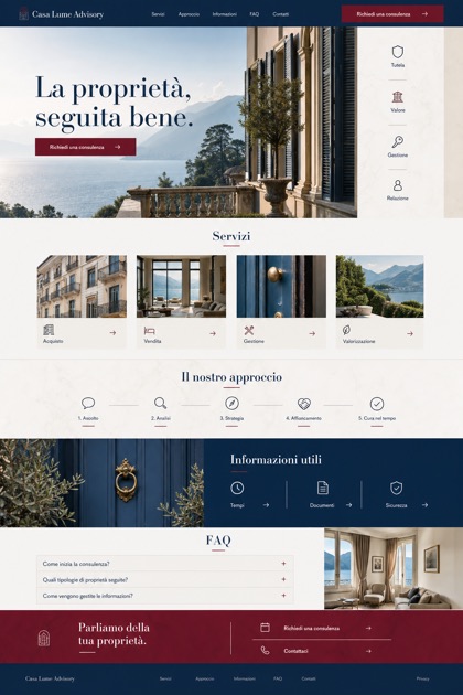
Compare how the same industry can use different hierarchy, imagery and inquiry structures without repeating one template.