01
Hierarchy
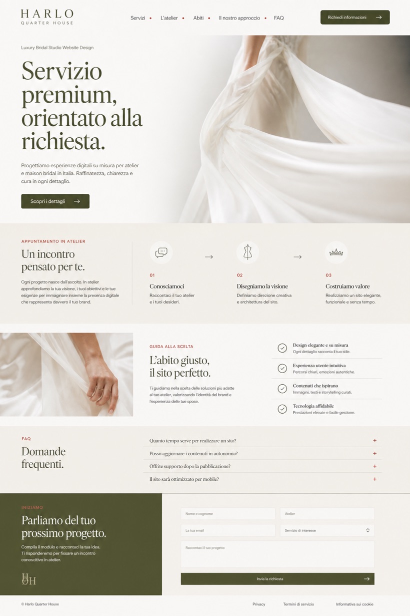
Collage-free editorial grid structures visual hierarchy cleanly.
Editorial grid showcase presenting one strong focal gesture alongside warm white and olive color schemes.
Design reading
Fictional Luxury bridal studio website design concept for Harlo Quarter House, with a clear service journey, practical information, FAQ, and inquiry path. This conceptual framework utilizes a collage-free editorial grid paired with alternating text density to elevate premium branding presence gracefully.
Independent fictional concept study; not client work or a live business.
Information and action
The notes explain the intended function of the concept rather than presenting the fictional brand as a client or live organisation.
01
Collage-free editorial grid structures visual hierarchy cleanly.
02
Alternating text density guides reader attention smoothly.
03
Tomato red navigation ticks provide subtle interactive cues.
Responsive thinking
The long presentation image is a showcase artefact. A live project would be rebuilt as responsive HTML rather than served as one tall image.
Mobile / 01
Single column stacking preserves focal gesture impact fully.
Mobile / 02
Padding increases prevent accidental taps on narrow viewports.
Delivery
Content, images and actions would be separated into accessible page components, with real text and controls at every viewport.
Weddings & Events
Compare how the same industry can use different hierarchy, imagery and inquiry structures without repeating one template.