01
Hierarchy
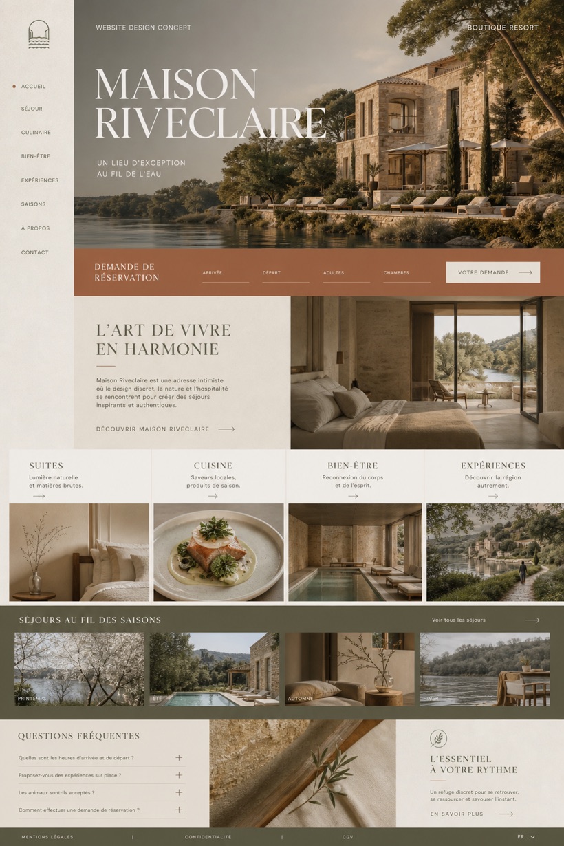
Architectural hospitality editorial styling emphasizes structural photography and refined typographic alignment for resort presentation.
This fictional hospitality interface displays resort accommodations through vertical index navigation paired with architecture focused imagery and a limestone olive clay color treatment.
Design reading
Fictional French boutique resort website concept with architectural hospitality photography, generic inquiry fields, stay cards, and FAQ. The concept applies a safe design methodology to showcase boutique resort environments digitally. A vertical index structure organizes property details while a dedicated grid manages room selections. Architectural photography anchors the header region with prominent masthead placement. The chosen palette incorporates limestone bases complemented by olive and clay undertones for organic warmth.
Independent fictional concept study; not client work or a live business.
Information and action
The notes explain the intended function of the concept rather than presenting the fictional brand as a client or live organisation.
01
Architectural hospitality editorial styling emphasizes structural photography and refined typographic alignment for resort presentation.
02
Vertical index navigation groups property sections sequentially while a structured grid manages accommodation selection modules.
03
Limestone olive and clay tones create an organic backdrop that reflects regional landscape materials and natural finishes.
Responsive thinking
The long presentation image is a showcase artefact. A live project would be rebuilt as responsive HTML rather than served as one tall image.
Mobile / 01
Horizontal scroll gestures replace dense navigation indices to optimize thumb reach on handheld devices.
Mobile / 02
Image grids collapse into single column arrangements to maintain visual pacing across reduced screen heights.
Delivery
Content, images and actions would be separated into accessible page components, with real text and controls at every viewport.
Hospitality
Compare how the same industry can use different hierarchy, imagery and inquiry structures without repeating one template.