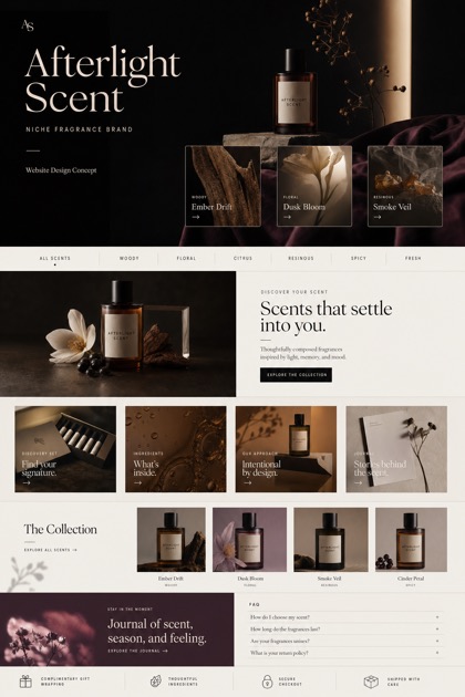
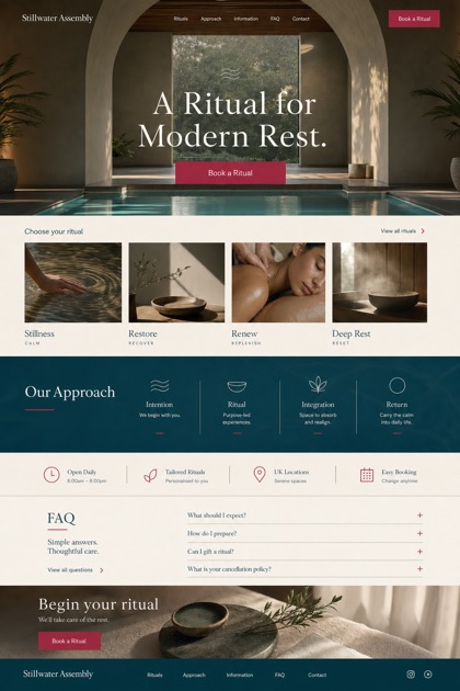
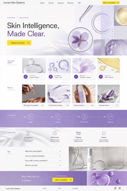
01
Hierarchy
Asymmetric retail grids arrange product photography alongside dedicated category cards to enable flexible browsing.
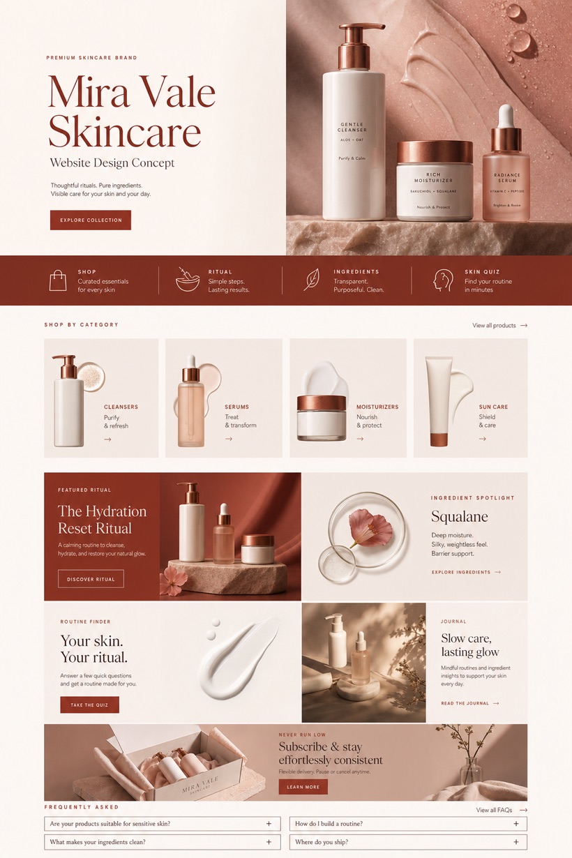
This conceptual beauty interface displays an American skincare brand utilizing asymmetric product grids, category selectors, ingredient highlights, routine finders, and clearly marked retail pathways.
Design reading
Fictional premium skincare website concept with refined product photography, category cards, ingredient notes, and routine finder. Built for a fictional American skincare retailer, this layout prioritizes asymmetric product grids paired with dedicated category selectors. Porcelain, berry, and copper tones consistently provide subtle warmth. Detailed ingredient notes and routine tools offer transparent product information without any promotional exaggeration whatsoever.
Independent fictional concept study; not client work or a live business.
Information and action
The notes explain the intended function of the concept rather than presenting the fictional brand as a client or live organisation.
01
Asymmetric retail grids arrange product photography alongside dedicated category cards to enable flexible browsing.
02
Product texture hero sections emphasize material qualities while guiding visitors downward toward routine tools.
03
Porcelain, berry, and copper color schemes deliver calm contrast suitable for detailed ingredient reviews.
Responsive thinking
The long presentation image is a showcase artefact. A live project would be rebuilt as responsive HTML rather than served as one tall image.
Mobile / 01
Portrait orientations reflow asymmetric grids into single-column stacks while fully preserving tactile interaction areas.
Mobile / 02
Sticky bottom rails adapt seamlessly to varying screen widths ensuring continuous checkout navigation access.
Delivery
Content, images and actions would be separated into accessible page components, with real text and controls at every viewport.
Beauty & Wellness
Compare how the same industry can use different hierarchy, imagery and inquiry structures without repeating one template.