01
Hierarchy
A sober legal advisory style anchors the overall visual tone throughout every interface component and typographic system.
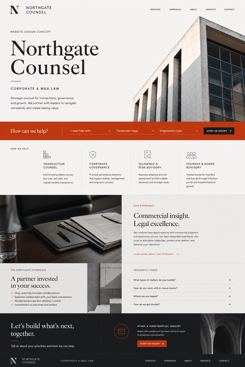
This fictional Canadian corporate law studio presents a sober advisory interface built around an architecture-text hero and structured service grid.
Design reading
Fictional Canadian corporate and M&A law website concept with sober advisory masthead, intake rail, service cards, and FAQ. The design explores a sober legal advisory aesthetic using a white charcoal and vermilion palette. An architecture-led hero establishes visual hierarchy before flowing into an inquiry-rail service grid. Clear navigation pathways guide visitors toward structured legal information and standardized consultation requests across dedicated platform pages.
Independent fictional concept study; not client work or a live business.
Information and action
The notes explain the intended function of the concept rather than presenting the fictional brand as a client or live organisation.
01
A sober legal advisory style anchors the overall visual tone throughout every interface component and typographic system.
02
An inquiry rail paired with a structured service grid organizes practice areas into clear navigational pathways.
03
Architecture-text hero pattern delivers bold editorial framing above a vermilion accent system across all interface layers.
Responsive thinking
The long presentation image is a showcase artefact. A live project would be rebuilt as responsive HTML rather than served as one tall image.
Mobile / 01
Interface elements collapse gracefully onto narrow viewports while preserving core service card accessibility and tap targets.
Mobile / 02
Vertical scrolling sequences optimize the inquiry rail layout for straightforward touch interaction on handheld devices.
Delivery
Content, images and actions would be separated into accessible page components, with real text and controls at every viewport.
Legal
Compare how the same industry can use different hierarchy, imagery and inquiry structures without repeating one template.