01
Hierarchy
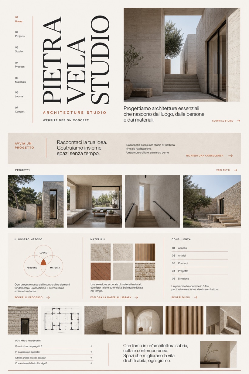
Vertical editorial typography anchors the hero section to establish clear visual hierarchy across archival project displays.
This conceptual interface presents an Italian architecture portfolio utilizing vertical typography, material studies, residential imagery, process overviews, and direct contact pathways.
Design reading
Fictional Italian architecture studio website concept with vertical editorial title, material grid, process cards, and inquiry path. Designed as a fictional Italian architectural practice, this layout emphasizes vertical editorial structures paired with structured material grids. Plaster, terracotta, and graphite tones establish a refined visual hierarchy. Clear navigation guides visitors through detailed project showcases, operational processes, and straightforward inquiry options without promotional claims.
Independent fictional concept study; not client work or a live business.
Information and action
The notes explain the intended function of the concept rather than presenting the fictional brand as a client or live organisation.
01
Vertical editorial typography anchors the hero section to establish clear visual hierarchy across archival project displays.
02
Structured material grids organize technical specifications alongside residential imagery to enable streamlined browsing experiences.
03
Plaster, terracotta, and graphite color strategies create restrained contrast that supports focused content evaluation.
Responsive thinking
The long presentation image is a showcase artefact. A live project would be rebuilt as responsive HTML rather than served as one tall image.
Mobile / 01
Compact viewports adjust grid columns to single stacks while maintaining readable vertical typography scales.
Mobile / 02
Touch interactions prioritize spacious tap targets and collapsible navigation sections for consistent cross-device access.
Delivery
Content, images and actions would be separated into accessible page components, with real text and controls at every viewport.
Architecture & Interiors
Compare how the same industry can use different hierarchy, imagery and inquiry structures without repeating one template.