01
Hierarchy
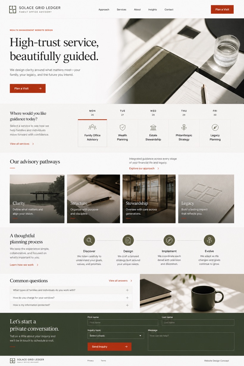
Calendar-like service selector structures the initial user journey.
Calendar-style service selector leading into image chapters and structured family office grids.
Design reading
Fictional Wealth management and family office website design concept for Solace Grid Ledger, with a clear service journey, practical information, FAQ, and inquiry path. This reference layout employs a calendar-like service selector before transitioning into image led chapters. Clear white and moss backgrounds pair with soft black text. Vermilion micro-accent markers emphasize key financial pathways.
Independent fictional concept study; not client work or a live business.
Information and action
The notes explain the intended function of the concept rather than presenting the fictional brand as a client or live organisation.
01
Calendar-like service selector structures the initial user journey.
02
Image-led chapters present detailed family office information clearly.
03
Vermilion micro-accents draw attention to core financial navigation.
Responsive thinking
The long presentation image is a showcase artefact. A live project would be rebuilt as responsive HTML rather than served as one tall image.
Mobile / 01
Touch-friendly grid alignment optimizes calendar selector interactions.
Mobile / 02
Responsive padding preserves spacing between image chapters seamlessly.
Delivery
Content, images and actions would be separated into accessible page components, with real text and controls at every viewport.
Finance
Compare how the same industry can use different hierarchy, imagery and inquiry structures without repeating one template.