01
Hierarchy
Clear cream backgrounds establish calm diagnostic reading zones.
Original WLA website design
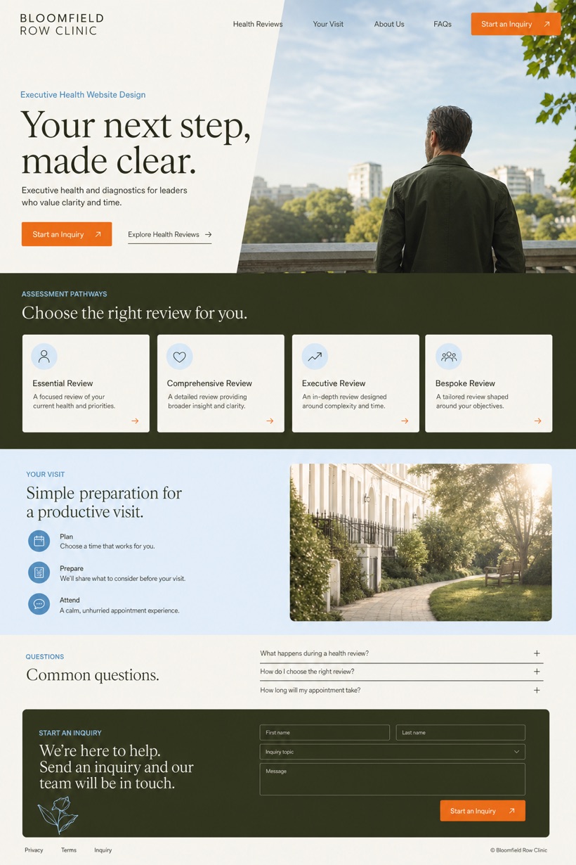
Executive Health & Diagnostics Website Design uses structured service-led layout to organise services, practical detail and a focused inquiry path for United Kingdom.
Design direction
This original WLA Webdesign direction is created for executive health and diagnostics in United Kingdom. It combines reference showcase with structured service-led layout and quiet magazine masthead with below fold process. The page sequence makes the main offer, supporting information and next action easy to understand, while clear cream, black olive, sky blue, and keeps important labels and calls to action clear across desktop and mobile screens.
Information and action
Each decision connects the visual direction to clearer services, stronger navigation and a more focused inquiry path.
01
Clear cream backgrounds establish calm diagnostic reading zones.
02
Black olive typography anchors structural information hierarchy effectively.
03
Precise orange controls direct attention to consultation actions.
Responsive thinking
The same hierarchy is planned for smaller screens so content stays readable, actions remain easy to reach and the visual character is preserved.
Mobile / 01
Stacked card layouts preserve readability across narrow viewports.
Mobile / 02
Flexible navigation chips adapt smoothly to touch interactions.
Delivery
The production site is delivered with accessible page components, real text and usable controls at every viewport.
Healthcare
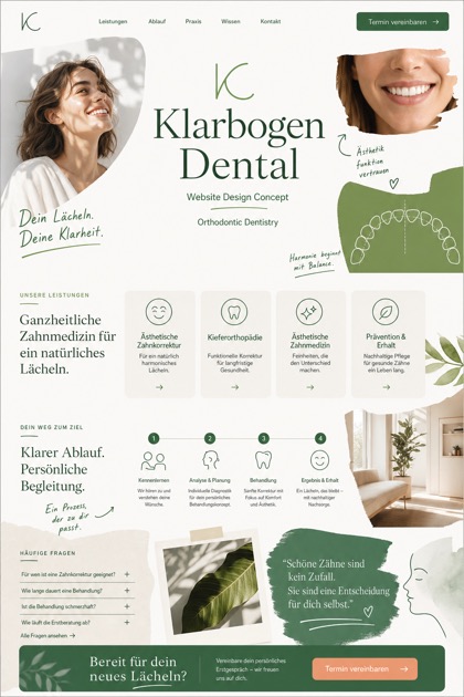
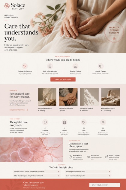
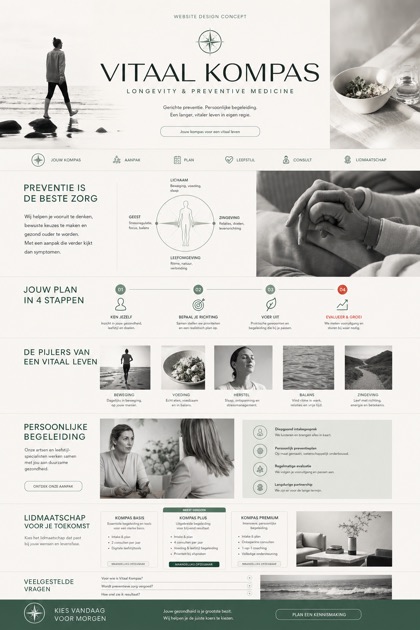
Compare how the same industry can use different hierarchy, imagery and inquiry structures without repeating one template.