01
Hierarchy
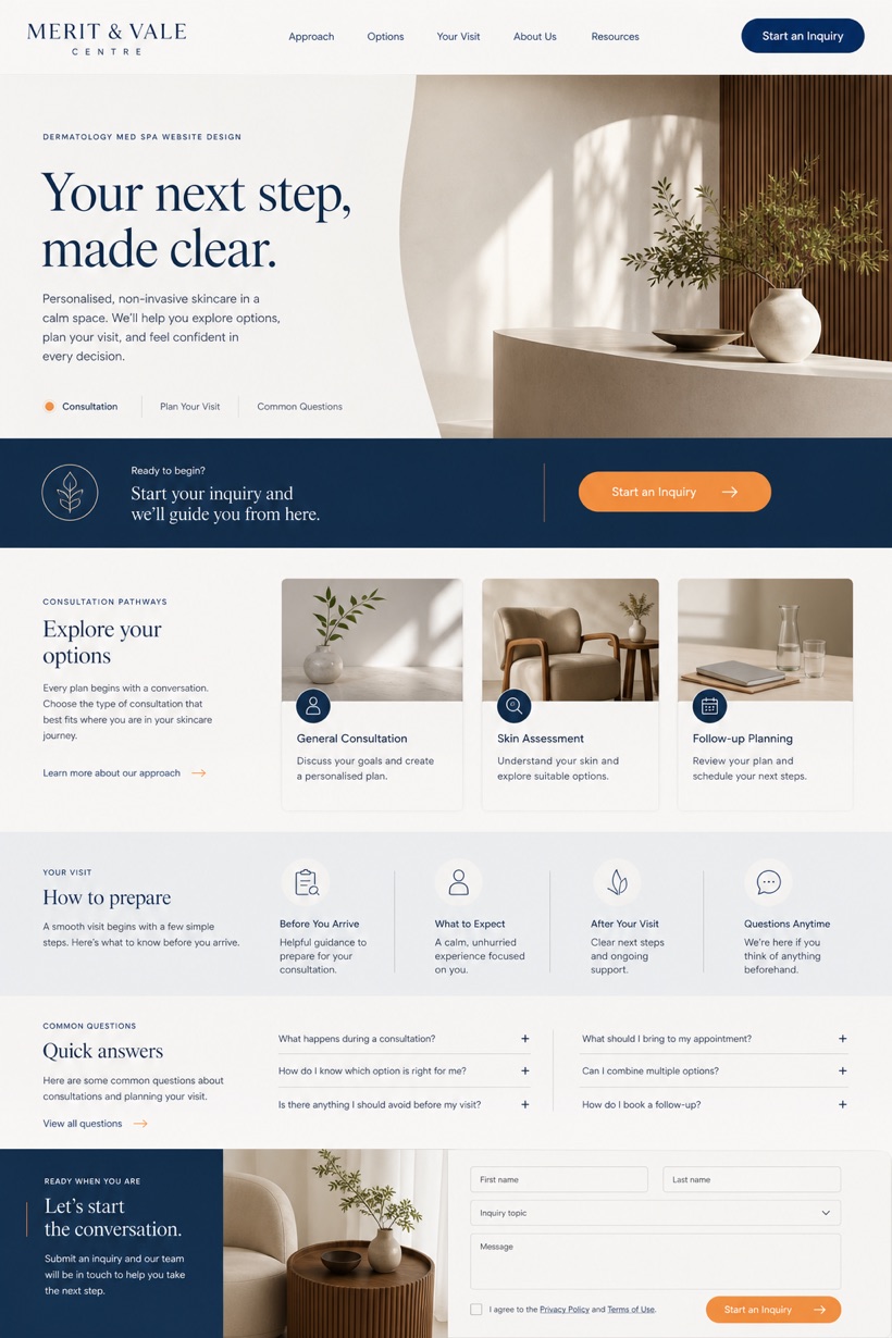
Editorial split placement pushes the call-to-action into a mid-page band.
Original WLA website design
Non-invasive Dermatology & Med Spa Website Design uses structured service-led layout to organise services, practical detail and a focused inquiry path for United Kingdom.
Design direction
This original WLA Webdesign direction is created for non-invasive dermatology and med spa in United Kingdom. It combines reference showcase with structured service-led layout and editorial split where the cta sits in. The page sequence makes the main offer, supporting information and next action easy to understand, while porcelain white, mineral blue, walnut, and restrained keeps important labels and calls to action clear across desktop and mobile screens.
Information and action
Each decision connects the visual direction to clearer services, stronger navigation and a more focused inquiry path.
01
Editorial split placement pushes the call-to-action into a mid-page band.
02
Porcelain white and mineral blue tones establish a clinical aesthetic.
03
Restrained citrus markers highlight key service navigation elements clearly.
Responsive thinking
The same hierarchy is planned for smaller screens so content stays readable, actions remain easy to reach and the visual character is preserved.
Mobile / 01
Single column stacking prevents mid-page band overlap on small screens.
Mobile / 02
Fluid typography scaling maintains readability across varying device widths.
Delivery
The production site is delivered with accessible page components, real text and usable controls at every viewport.
Healthcare
Compare how the same industry can use different hierarchy, imagery and inquiry structures without repeating one template.