01
Hierarchy
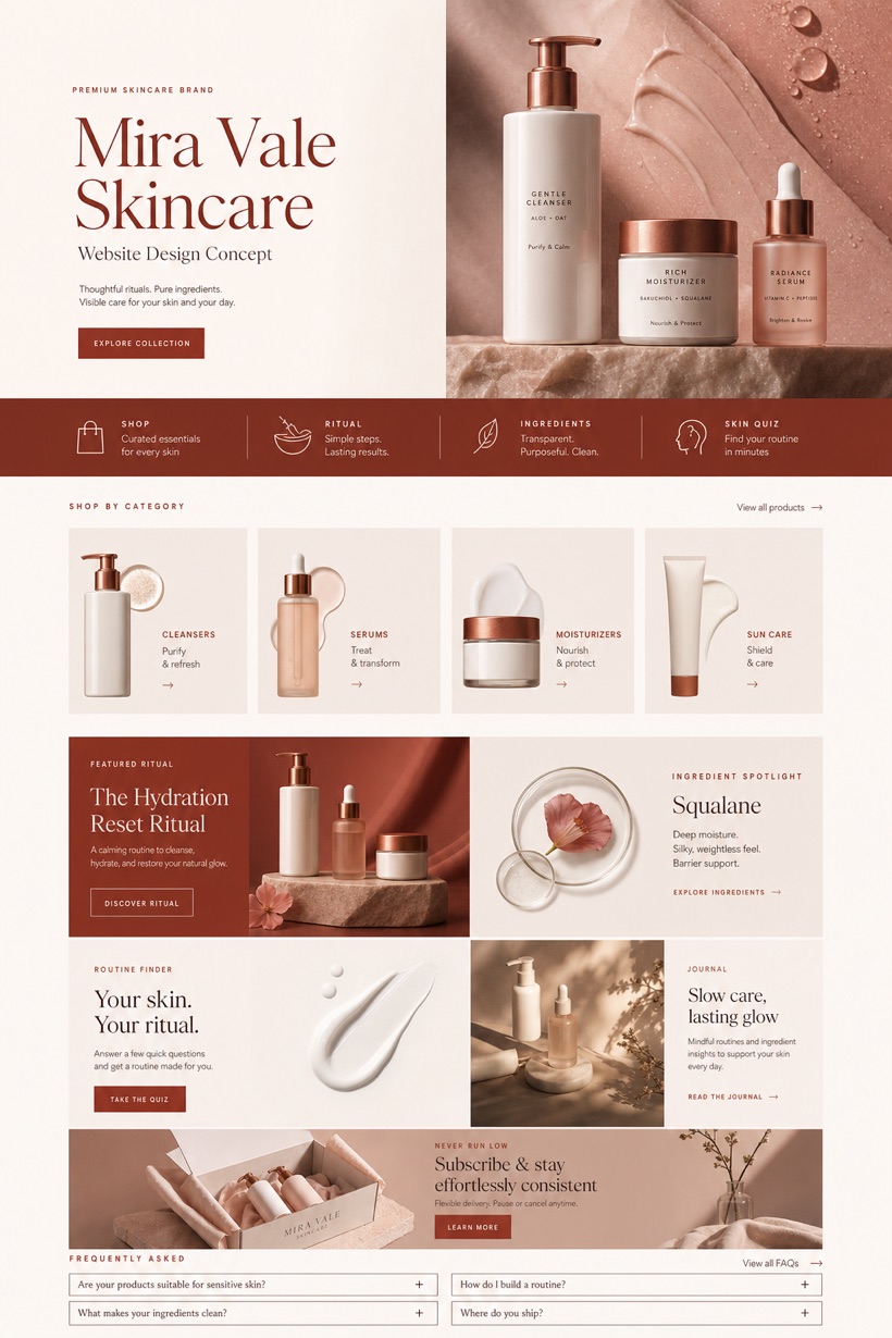
Asymmetric retail grids arrange product photography alongside dedicated category cards to enable flexible browsing.
Original WLA website design
Premium Skincare Brand Website Design uses asymmetric product retail to organise services, practical detail and a focused inquiry path for United States.
Design direction
This original WLA Webdesign direction is created for premium skincare brand in United States. It combines refined skincare commerce with asymmetric product retail and product texture hero bottom rail. The page sequence makes the main offer, supporting information and next action easy to understand, while porcelain berry copper keeps important labels and calls to action clear across desktop and mobile screens.
Information and action
Each decision connects the visual direction to clearer services, stronger navigation and a more focused inquiry path.
01
Asymmetric retail grids arrange product photography alongside dedicated category cards to enable flexible browsing.
02
Product texture hero sections emphasize material qualities while guiding visitors downward toward routine tools.
03
Porcelain, berry, and copper color schemes deliver calm contrast suitable for detailed ingredient reviews.
Responsive thinking
The same hierarchy is planned for smaller screens so content stays readable, actions remain easy to reach and the visual character is preserved.
Mobile / 01
Portrait orientations reflow asymmetric grids into single-column stacks while fully preserving tactile interaction areas.
Mobile / 02
Sticky bottom rails adapt seamlessly to varying screen widths ensuring continuous checkout navigation access.
Delivery
The production site is delivered with accessible page components, real text and usable controls at every viewport.
Beauty & Wellness
Compare how the same industry can use different hierarchy, imagery and inquiry structures without repeating one template.