01
Hierarchy
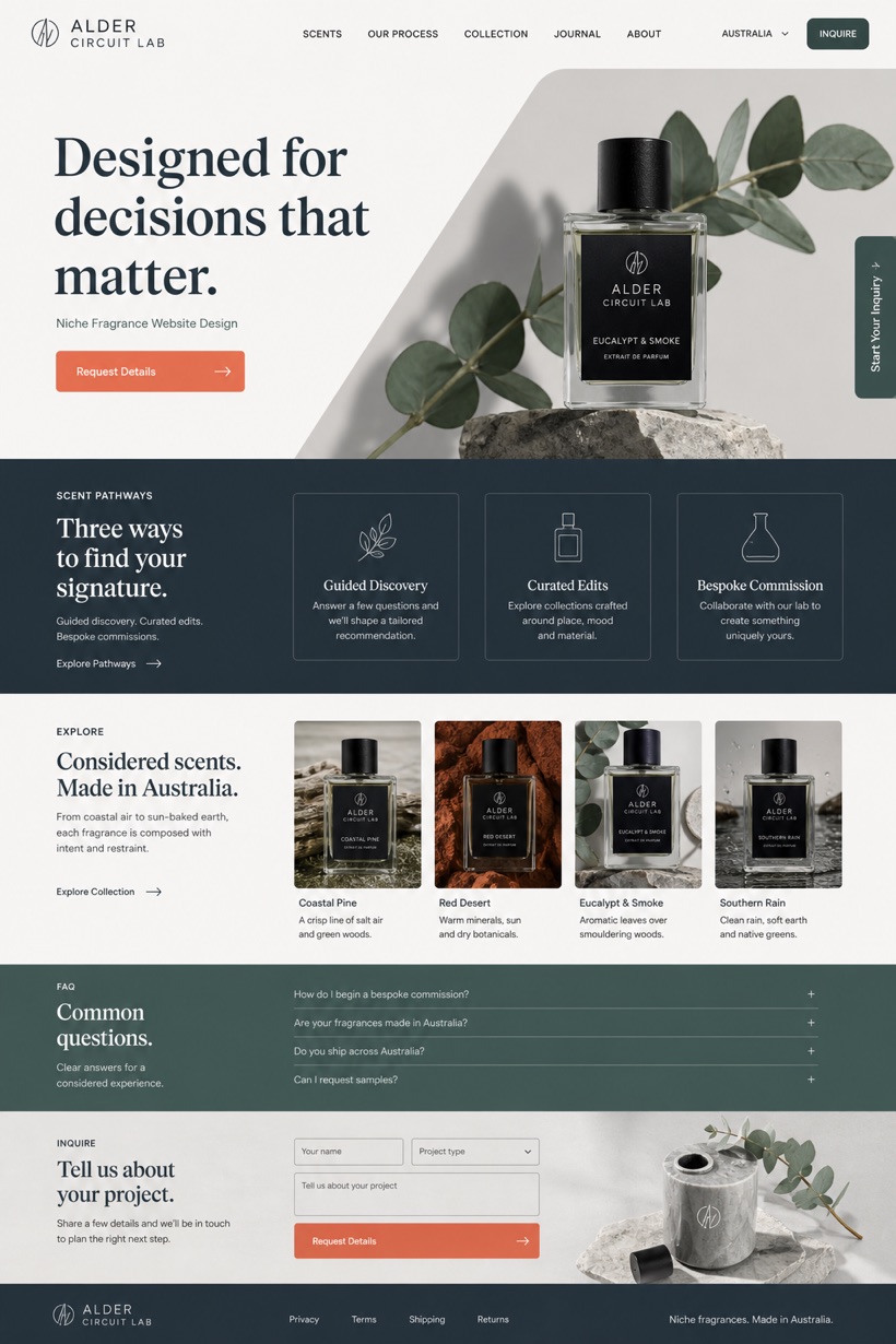
Diagonal screen flows establish dynamic visual movement naturally.
Diagonal first screen flows pair compact tabs with stepped information bands.
Design reading
Fictional Niche fragrance brand website design concept for Alder Circuit Lab, with a clear service journey, practical information, FAQ, and inquiry path. This safe concept leverages bone white and cobalt grey foundations alongside eucalyptus hues. Coral conversion marks highlight critical interaction zones while maintaining structured clarity.
Independent fictional concept study; not client work or a live business.
Information and action
The notes explain the intended function of the concept rather than presenting the fictional brand as a client or live organisation.
01
Diagonal screen flows establish dynamic visual movement naturally.
02
Compact action tabs reduce interface clutter significantly.
03
Coral conversion marks draw attention to key pathways.
Responsive thinking
The long presentation image is a showcase artefact. A live project would be rebuilt as responsive HTML rather than served as one tall image.
Mobile / 01
Adaptive spacing preserves visual balance during horizontal swipes.
Mobile / 02
Simplified navigation menus prevent accidental input errors frequently.
Delivery
Content, images and actions would be separated into accessible page components, with real text and controls at every viewport.
Beauty & Wellness
Compare how the same industry can use different hierarchy, imagery and inquiry structures without repeating one template.