01
Hierarchy
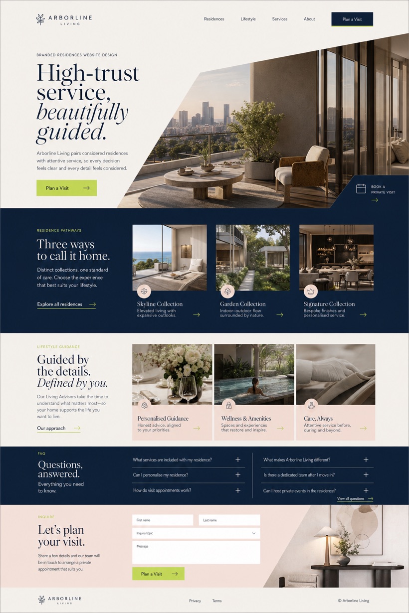
Diagonal composition adds dynamic movement across the first screen.
Diagonal flow directs attention toward compact action tabs and stepped bands.
Design reading
Fictional Branded residences website design concept for Arborline Living, with a clear service journey, practical information, FAQ, and inquiry path. The study uses reference showcase direction with a source derived layout structure and a diagonal first screen flow with a compact action tab and stepped information bands opening pattern. Its travertine white, navy ink, warm blush, and fresh lime markers colour approach supports a clear reading order from context to inquiry without presenting the fictional brand as an operating business.
Independent fictional concept study; not client work or a live business.
Information and action
The notes explain the intended function of the concept rather than presenting the fictional brand as a client or live organisation.
01
Diagonal composition adds dynamic movement across the first screen.
02
Travertine white backgrounds support warm blush and navy ink tones.
03
Fresh lime markers emphasize key navigation and booking steps.
Responsive thinking
The long presentation image is a showcase artefact. A live project would be rebuilt as responsive HTML rather than served as one tall image.
Mobile / 01
Linear stacking restores diagonal alignment for vertical screens.
Mobile / 02
Compact tabs expand into full-width interactive elements.
Delivery
Content, images and actions would be separated into accessible page components, with real text and controls at every viewport.
Property
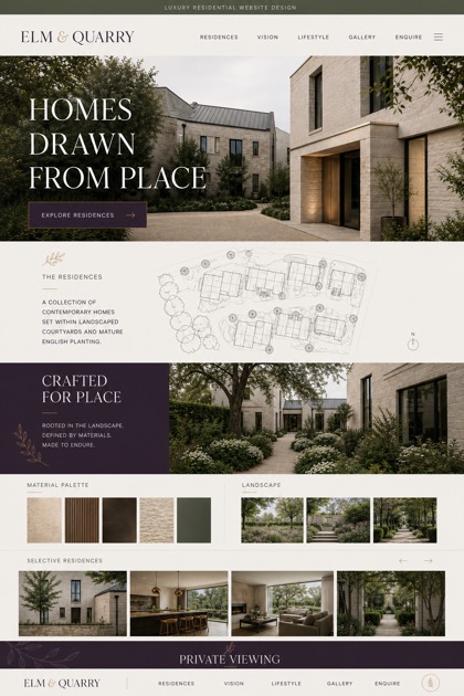
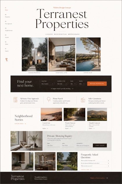
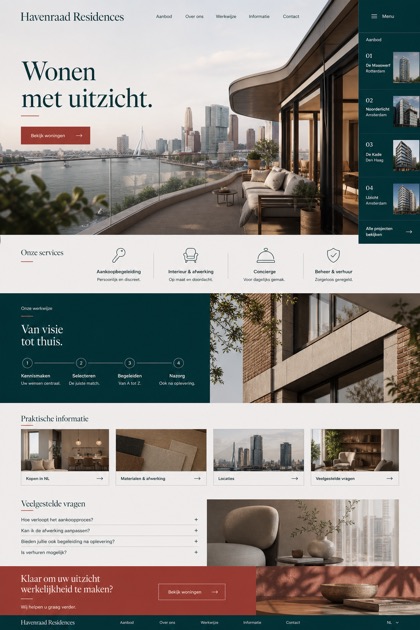
Compare how the same industry can use different hierarchy, imagery and inquiry structures without repeating one template.