01
Hierarchy
Silver white layers establish calm foundations beneath clean beauty science masthead headers.
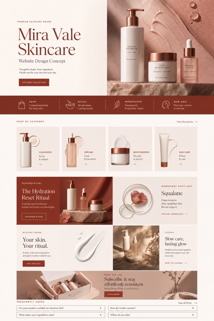
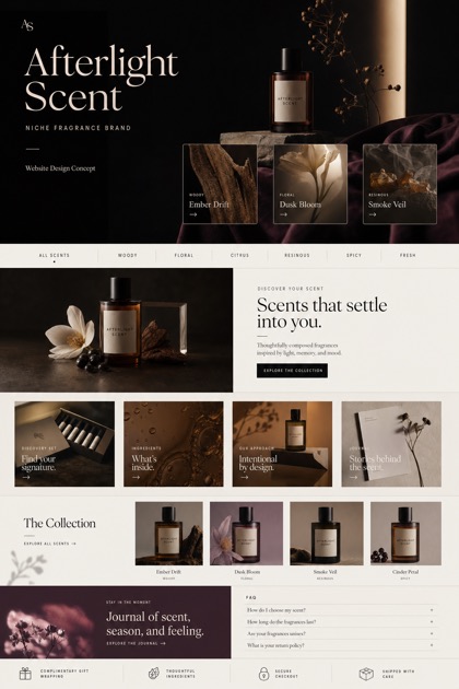
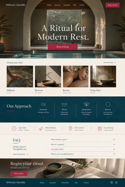
Showcase grid presenting clean beauty science mastheads alongside ingredient style modules for tech focused wellness brands.
Design reading
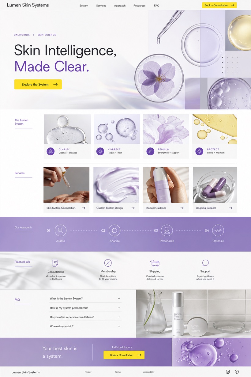
Fictional Beauty technology brand website design concept for Lumen Skin Systems, with a clear service journey, practical information, FAQ, and inquiry path. The structure combines a silver white backdrop with violet visual framing and safety yellow navigational triggers. Ingredient style modules break down technical specifications systematically while preserving a minimalist aesthetic aligned with contemporary skincare branding.
Independent fictional concept study; not client work or a live business.
Information and action
The notes explain the intended function of the concept rather than presenting the fictional brand as a client or live organisation.
01
Silver white layers establish calm foundations beneath clean beauty science masthead headers.
02
Violet borders segment data clearly within ingredient style module groupings.
03
Safety yellow highlights activate primary call to action pathways efficiently.
Responsive thinking
The long presentation image is a showcase artefact. A live project would be rebuilt as responsive HTML rather than served as one tall image.
Mobile / 01
Fluid grids reflow seamlessly across varying tablet and phone widths.
Mobile / 02
Simplified menus collapse automatically to conserve limited viewport space.
Delivery
Content, images and actions would be separated into accessible page components, with real text and controls at every viewport.
Beauty & Wellness
Compare how the same industry can use different hierarchy, imagery and inquiry structures without repeating one template.