01
Hierarchy
Precise clinical editorial style prioritizes legible typography and structured information hierarchy for medical contexts.
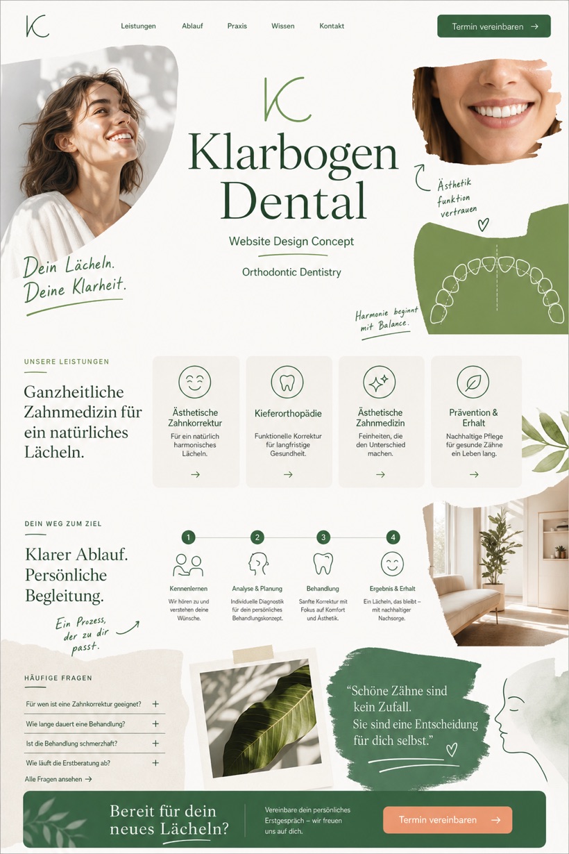
This fictional healthcare layout presents orthodontic services through a structured editorial framework with centered masthead navigation and annotated patient pathways.
Design reading
Fictional orthodontic and aesthetic dentistry website concept with a 2:3 editorial healthcare layout, service cards, patient pathway, and appointment flow. The concept demonstrates a safe design approach for dental practices requiring clear clinical information. A centered masthead anchors the header while a dedicated service rail organizes treatment categories. Annotated imagery highlights procedural steps with calibrated typography. The selected color scheme utilizes daylight greens paired with clay accents to support medical readability.
Independent fictional concept study; not client work or a live business.
Information and action
The notes explain the intended function of the concept rather than presenting the fictional brand as a client or live organisation.
01
Precise clinical editorial style prioritizes legible typography and structured information hierarchy for medical contexts.
02
Centered masthead combined with a vertical service rail organizes care categories into accessible navigation modules.
03
Daylight green and clay accents establish a calming medical environment while maintaining sufficient contrast ratios.
Responsive thinking
The long presentation image is a showcase artefact. A live project would be rebuilt as responsive HTML rather than served as one tall image.
Mobile / 01
Stacked column layouts adapt service rail components for vertical scrolling on compact screens.
Mobile / 02
Annotated graphics resize proportionally to preserve instructional clarity across different viewport widths.
Delivery
Content, images and actions would be separated into accessible page components, with real text and controls at every viewport.
Healthcare
Compare how the same industry can use different hierarchy, imagery and inquiry structures without repeating one template.