01
Hierarchy
Centered dashboard layouts organize preventive care metrics and lifestyle pillars to ensure immediate visibility.
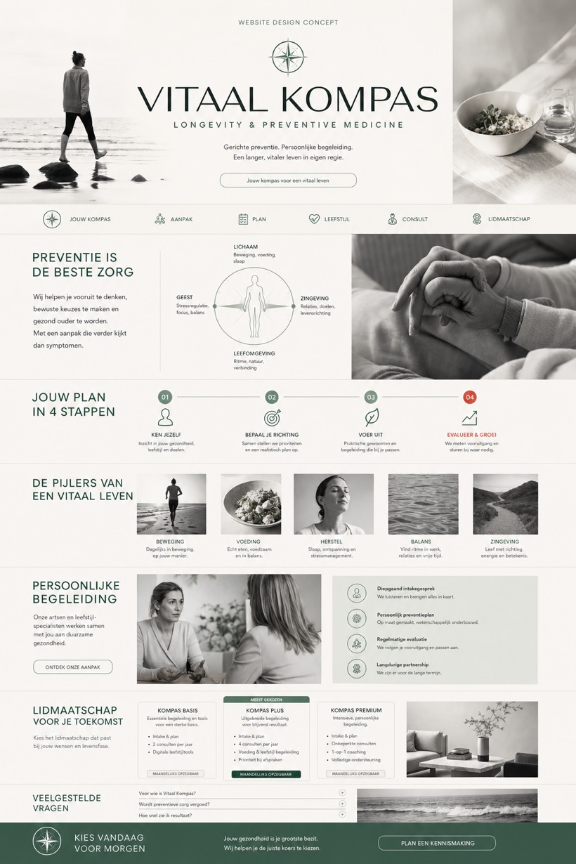
This conceptual medical interface presents a Dutch longevity practice utilizing centered dashboards, care pillars, lifestyle imagery, membership-style cards, and comprehensive question sections.
Design reading
Fictional Dutch longevity and preventive medicine website concept with compass-led masthead, care pillars, plan flow, and FAQ. Conceptualized for a fictional Dutch preventive medicine practice, this design centers on diagnostic dashboard frameworks paired with distinct care pillars. White, seagreen, and redorange palettes maintain clinical clarity throughout. Structured plan flows guide users thoroughly through membership-style cards and foundational health information efficiently.
Independent fictional concept study; not client work or a live business.
Information and action
The notes explain the intended function of the concept rather than presenting the fictional brand as a client or live organisation.
01
Centered dashboard layouts organize preventive care metrics and lifestyle pillars to ensure immediate visibility.
02
Compass-led mastheads anchor primary navigation while directing attention toward structured membership-style plan options.
03
White, seagreen, and redorange color strategies ensure high contrast across all diagnostic interface screens.
Responsive thinking
The long presentation image is a showcase artefact. A live project would be rebuilt as responsive HTML rather than served as one tall image.
Mobile / 01
Narrow screens collapse dashboard grids into stacked vertical sequences while preserving essential data readability.
Mobile / 02
Bottom navigation bars shift upward automatically to comfortably accommodate thumb-friendly touch interactions.
Delivery
Content, images and actions would be separated into accessible page components, with real text and controls at every viewport.
Healthcare
Compare how the same industry can use different hierarchy, imagery and inquiry structures without repeating one template.