01
Hierarchy
Warm clinical editorial style balances professional medical formatting with softened typographic weights for approachable readability.
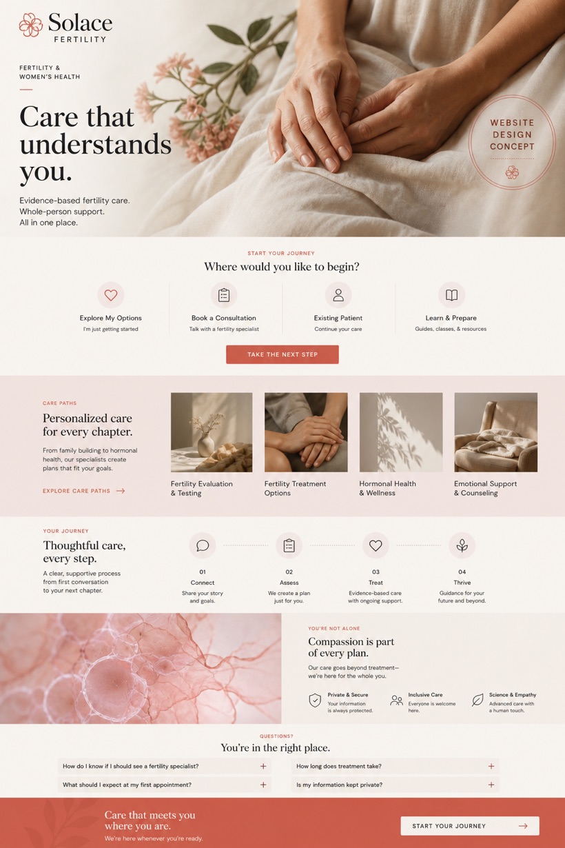
This fictional medical interface outlines fertility treatments through image driven card layouts paired with guided pathway navigation and a soft ivory coral color scheme.
Design reading
Fictional fertility and women health website concept with warm clinical editorial design, care paths, privacy cues, and consultation flow. The project explores a creative directional approach to presenting specialized women health services online. Large format imagery leads each section while supportive cards provide contextual treatment details. A side stamp pattern positions care guidance alongside primary visuals. The applied color strategy combines ivory bases with subtle rose, clay, and coral highlights to foster a welcoming clinical atmosphere.
Independent fictional concept study; not client work or a live business.
Information and action
The notes explain the intended function of the concept rather than presenting the fictional brand as a client or live organisation.
01
Warm clinical editorial style balances professional medical formatting with softened typographic weights for approachable readability.
02
Side stamp care masthead anchors primary messaging while image first cards guide users through sequential treatment pathways.
03
Ivory rose clay and coral tones establish a gentle backdrop that supports medical content without overwhelming visual density.
Responsive thinking
The long presentation image is a showcase artefact. A live project would be rebuilt as responsive HTML rather than served as one tall image.
Mobile / 01
Card containers expand vertically to preserve image visibility while maintaining adequate touch interaction areas.
Mobile / 02
Navigation stamps reposition above primary content blocks to ensure immediate access on constrained screen dimensions.
Delivery
Content, images and actions would be separated into accessible page components, with real text and controls at every viewport.
Healthcare
Compare how the same industry can use different hierarchy, imagery and inquiry structures without repeating one template.