01
Hierarchy
Optical grid structure organizes complex data cleanly.
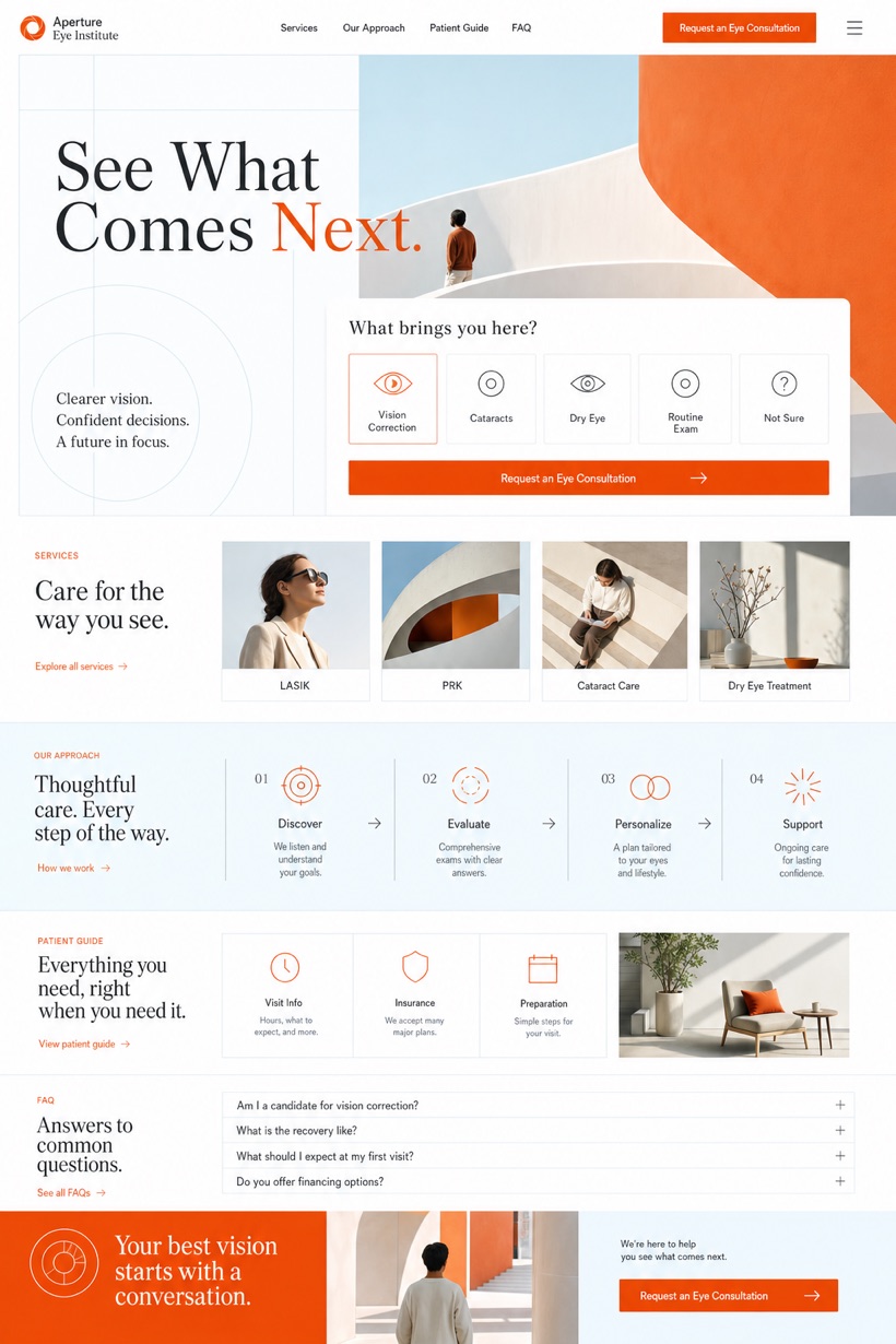
Optical grid hero showcases creative medical aesthetics with measured service selector.
Design reading
Fictional Ophthalmology and vision correction website design concept for Aperture Eye Institute, with a clear service journey, practical information, FAQ, and inquiry path. This creative layout employs clear source derived grids combining optical white pale cyan burnt orange shades for precise anatomical framing.
Independent fictional concept study; not client work or a live business.
Information and action
The notes explain the intended function of the concept rather than presenting the fictional brand as a client or live organisation.
01
Optical grid structure organizes complex data cleanly.
02
Pale cyan highlights complement burnt orange selections.
03
Measured selector simplifies decision making processes.
Responsive thinking
The long presentation image is a showcase artefact. A live project would be rebuilt as responsive HTML rather than served as one tall image.
Mobile / 01
Simplified grids reduce cognitive load on small screens.
Mobile / 02
Adaptive padding preserves breathable whitespace consistently.
Delivery
Content, images and actions would be separated into accessible page components, with real text and controls at every viewport.
Healthcare
Compare how the same industry can use different hierarchy, imagery and inquiry structures without repeating one template.