01
Hierarchy
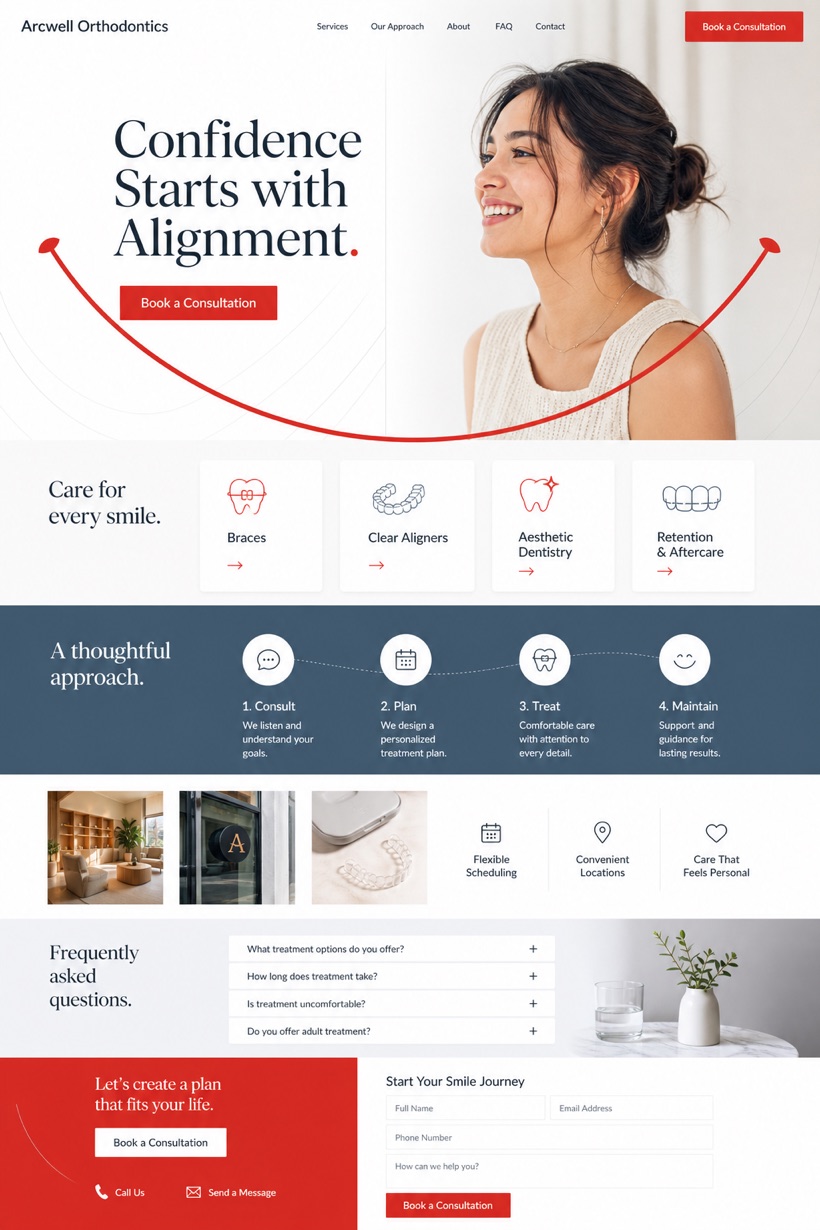
White canvas provides ample breathing room around type led smile arc visuals.
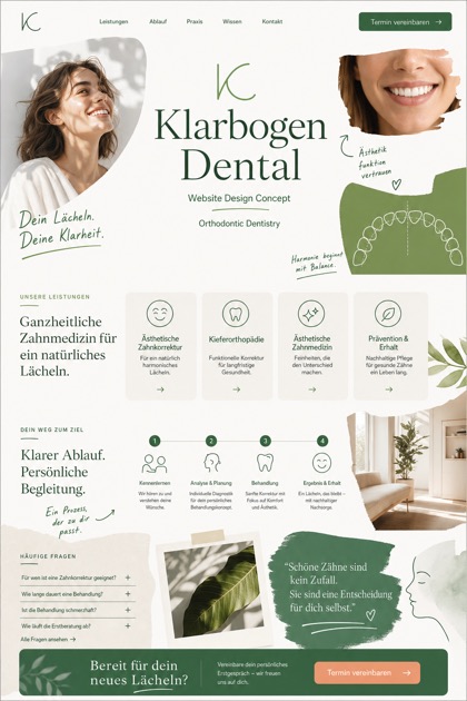
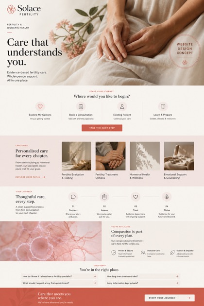
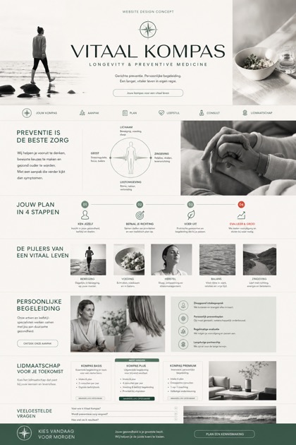
Reference grid displaying type led smile arcs alongside sequential care cards for dental practices.
Design reading
Fictional Orthodontics and aesthetic dentistry website design concept for Arcwell Orthodontics, with a clear service journey, practical information, FAQ, and inquiry path. This layout features a clean white foundation with tomato red buttons and blue grey secondary text. Sequential care cards organize treatment pathways logically while maintaining high contrast standards for readability and professional presentation.
Independent fictional concept study; not client work or a live business.
Information and action
The notes explain the intended function of the concept rather than presenting the fictional brand as a client or live organisation.
01
White canvas provides ample breathing room around type led smile arc visuals.
02
Tomato red markers draw attention to sequential care card progression steps.
03
Blue grey utility text establishes secondary information hierarchy effectively throughout.
Responsive thinking
The long presentation image is a showcase artefact. A live project would be rebuilt as responsive HTML rather than served as one tall image.
Mobile / 01
Vertical stacking optimizes vertical scroll performance on smaller displays.
Mobile / 02
Adjusted tap zones ensure comfortable one handed navigation accessibility.
Delivery
Content, images and actions would be separated into accessible page components, with real text and controls at every viewport.
Healthcare
Compare how the same industry can use different hierarchy, imagery and inquiry structures without repeating one template.