01
Hierarchy
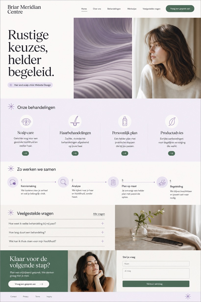
Gallery white canvas contrasts sharply with ink typography for clarity.
Three cell viewport layout with navigation, hero crop, and next step block.
Design reading
Fictional Hair and scalp clinic website design concept for Briar Meridian Centre, with a clear service journey, practical information, FAQ, and inquiry path. This reference showcase utilizes a three cell first viewport with dedicated navigation, a focused hero crop, and a practical next step block below.
Independent fictional concept study; not client work or a live business.
Information and action
The notes explain the intended function of the concept rather than presenting the fictional brand as a client or live organisation.
01
Gallery white canvas contrasts sharply with ink typography for clarity.
02
Muted lavender accents soften the layout without reducing professional tone.
03
Fresh green status cues guide users toward actionable next steps.
Responsive thinking
The long presentation image is a showcase artefact. A live project would be rebuilt as responsive HTML rather than served as one tall image.
Mobile / 01
Single column stacking maintains readability on smaller smartphone screens.
Mobile / 02
Adjusting padding prevents touch target overlap during quick navigation swipes.
Delivery
Content, images and actions would be separated into accessible page components, with real text and controls at every viewport.
Healthcare
Compare how the same industry can use different hierarchy, imagery and inquiry structures without repeating one template.