01
Hierarchy
Oversized headlines command immediate attention without overwhelming the layout.
Oversized central headline anchors bottom navigation with alternating chapter widths.
Design reading
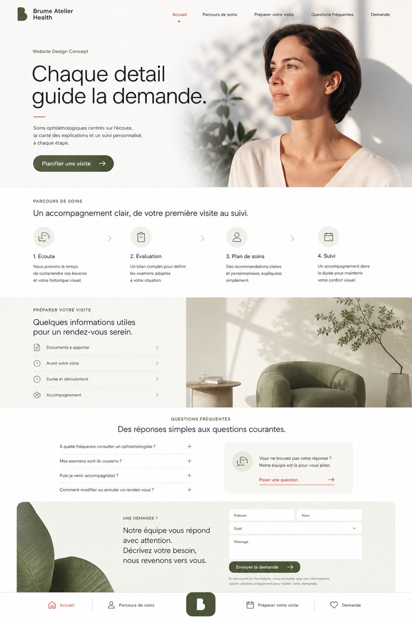
Fictional Ophthalmology and vision correction website design concept for Brume Atelier Health, with a clear service journey, practical information, FAQ, and inquiry path. The study uses reference showcase direction with a source derived layout structure and a bottom navigation bar with oversized central headline and alternating chapter widths opening pattern. Its clear white, moss, soft black, and vermilion micro accents colour approach supports a clear reading order from context to inquiry without presenting the fictional brand as an operating business.
Independent fictional concept study; not client work or a live business.
Information and action
The notes explain the intended function of the concept rather than presenting the fictional brand as a client or live organisation.
01
Oversized headlines command immediate attention without overwhelming the layout.
02
Alternating chapter widths create rhythmic visual breathing room.
03
Vermilion micro-accents selectively draw eyes to critical care steps.
Responsive thinking
The long presentation image is a showcase artefact. A live project would be rebuilt as responsive HTML rather than served as one tall image.
Mobile / 01
Bottom navigation shifts to fixed bars for easy thumb reach.
Mobile / 02
Chapter widths compress into uniform scrolling sequences.
Delivery
Content, images and actions would be separated into accessible page components, with real text and controls at every viewport.
Healthcare
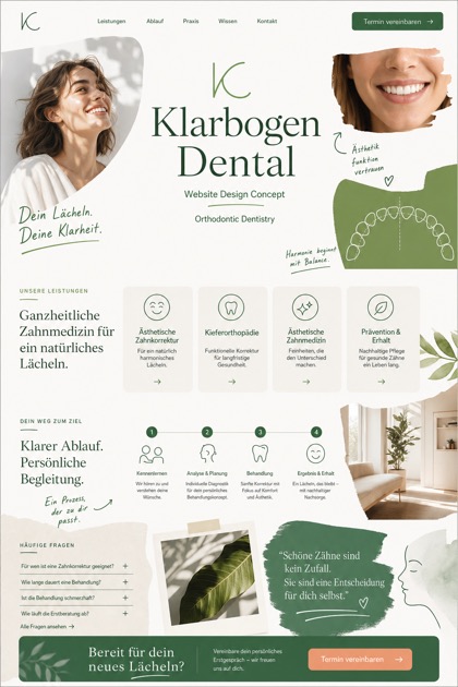
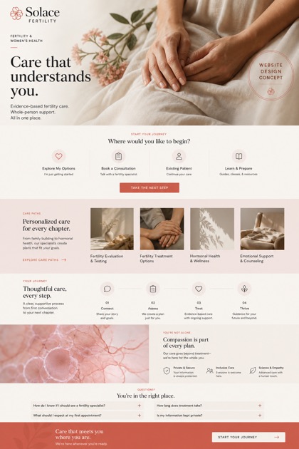
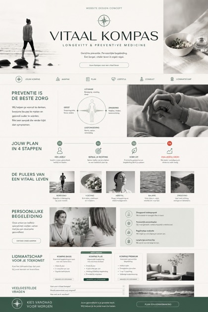
Compare how the same industry can use different hierarchy, imagery and inquiry structures without repeating one template.