01
Hierarchy
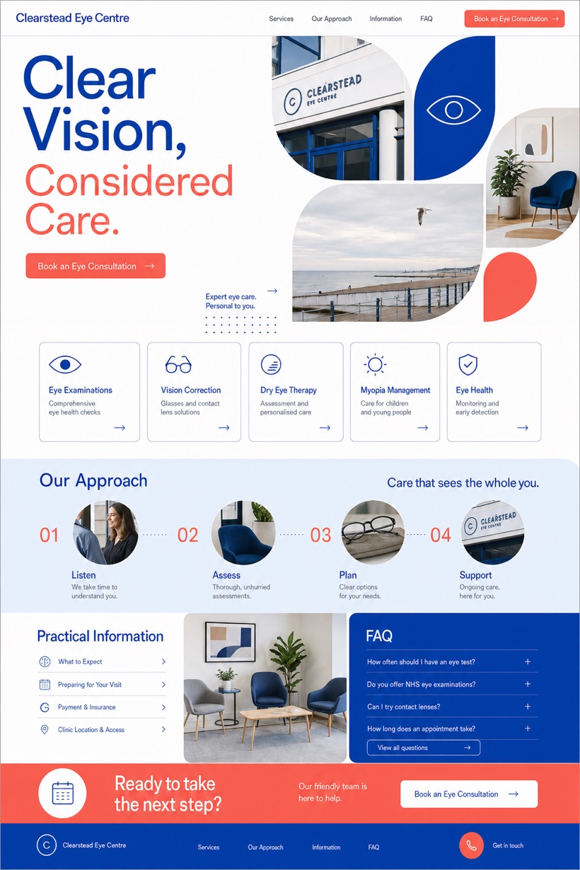
Optical white fields maximize contrast for the optical typography masthead text.
Medical reference display pairing optical typography mastheads with precise care cards for ophthalmology clinics.
Design reading
Fictional Ophthalmology and vision correction website design concept for Clearstead Eye Centre, with a clear service journey, practical information, FAQ, and inquiry path. This interface relies on an optical white foundation paired with royal blue data headers and coral engagement buttons. Optical typography mastheads command immediate attention while precise care cards arrange diagnostic procedures into logical chronological sequences.
Independent fictional concept study; not client work or a live business.
Information and action
The notes explain the intended function of the concept rather than presenting the fictional brand as a client or live organisation.
01
Optical white fields maximize contrast for the optical typography masthead text.
02
Royal blue separators distinguish each section without causing visual fatigue.
03
Coral triggers provide clear directional cues within the precise care cards rows.
Responsive thinking
The long presentation image is a showcase artefact. A live project would be rebuilt as responsive HTML rather than served as one tall image.
Mobile / 01
Horizontal scroll containers convert reliably into vertical stacked lists.
Mobile / 02
Font scaling maintains optimal legibility across diverse mobile device sizes.
Delivery
Content, images and actions would be separated into accessible page components, with real text and controls at every viewport.
Healthcare
Compare how the same industry can use different hierarchy, imagery and inquiry structures without repeating one template.