01
Hierarchy
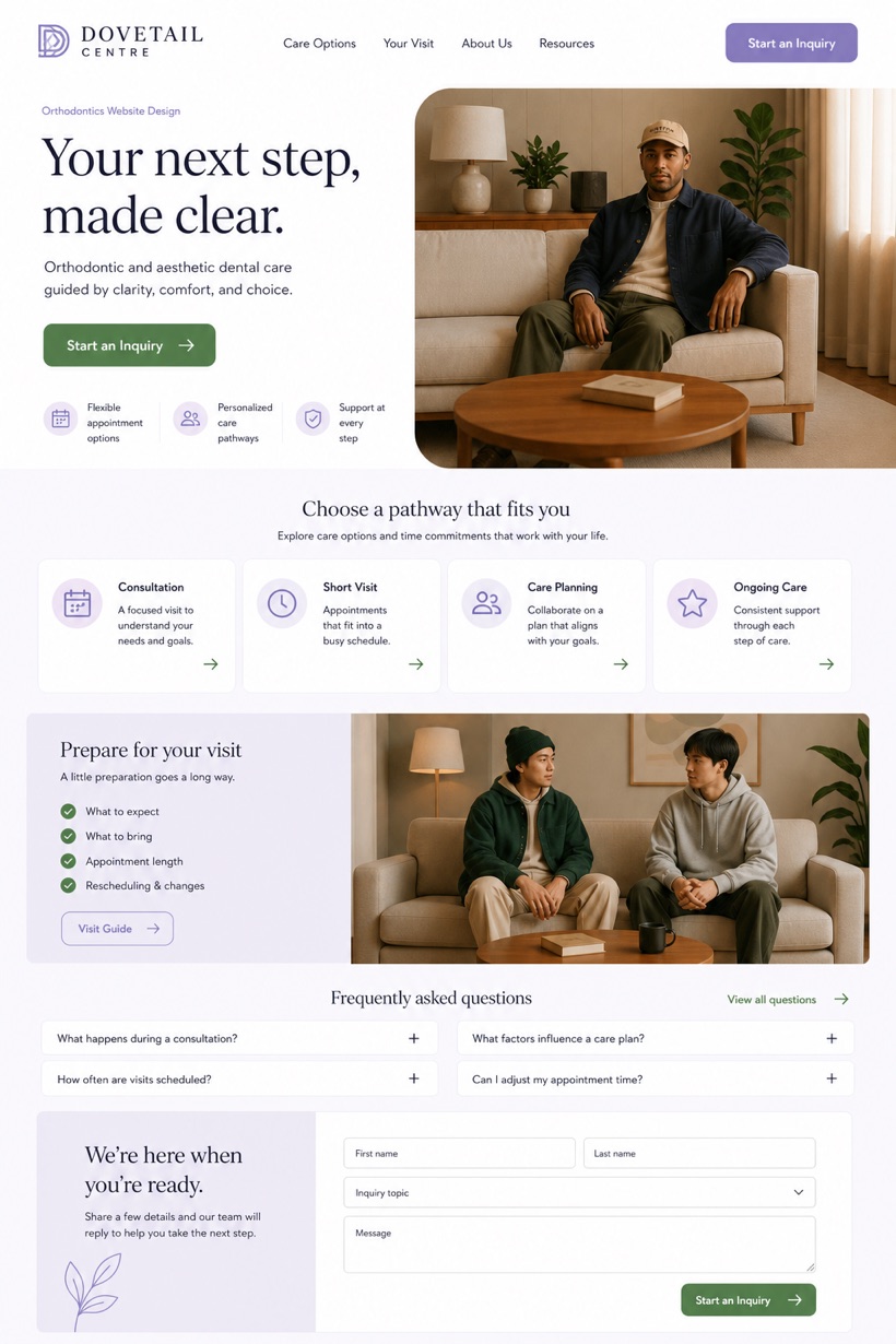
Gallery white backgrounds create clean uncluttered visual foundations.
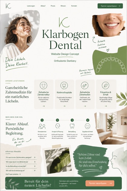
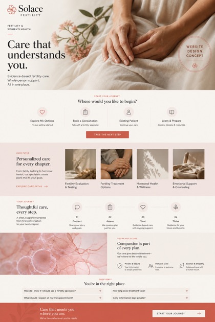
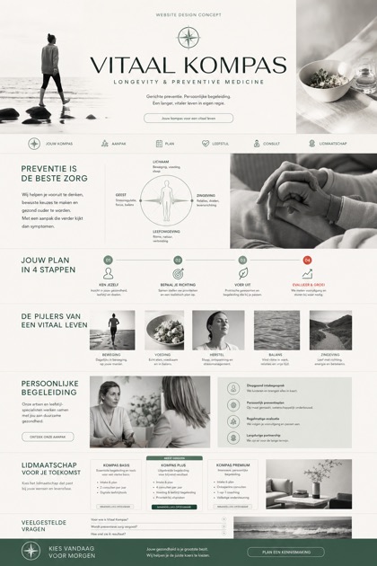
Reference showcase highlighting ample white space and narrow photo ribbon elements above conversion modules.
Design reading
Fictional Orthodontics and aesthetic dentistry website design concept for Dovetail Centre, with a clear service journey, practical information, FAQ, and inquiry path. This reference presentation integrates a large white space hero alongside an anchored conversion module to streamline patient pathways effectively.
Independent fictional concept study; not client work or a live business.
Information and action
The notes explain the intended function of the concept rather than presenting the fictional brand as a client or live organisation.
01
Gallery white backgrounds create clean uncluttered visual foundations.
02
Narrow photo ribbon organizes imagery with minimal screen intrusion.
03
Muted lavender accents soften overall interface composition significantly.
Responsive thinking
The long presentation image is a showcase artefact. A live project would be rebuilt as responsive HTML rather than served as one tall image.
Mobile / 01
Fluid grids automatically adjust column widths for smaller displays.
Mobile / 02
Conversion modules reposition topward for immediate visibility on phones.
Delivery
Content, images and actions would be separated into accessible page components, with real text and controls at every viewport.
Healthcare
Compare how the same industry can use different hierarchy, imagery and inquiry structures without repeating one template.