01
Hierarchy
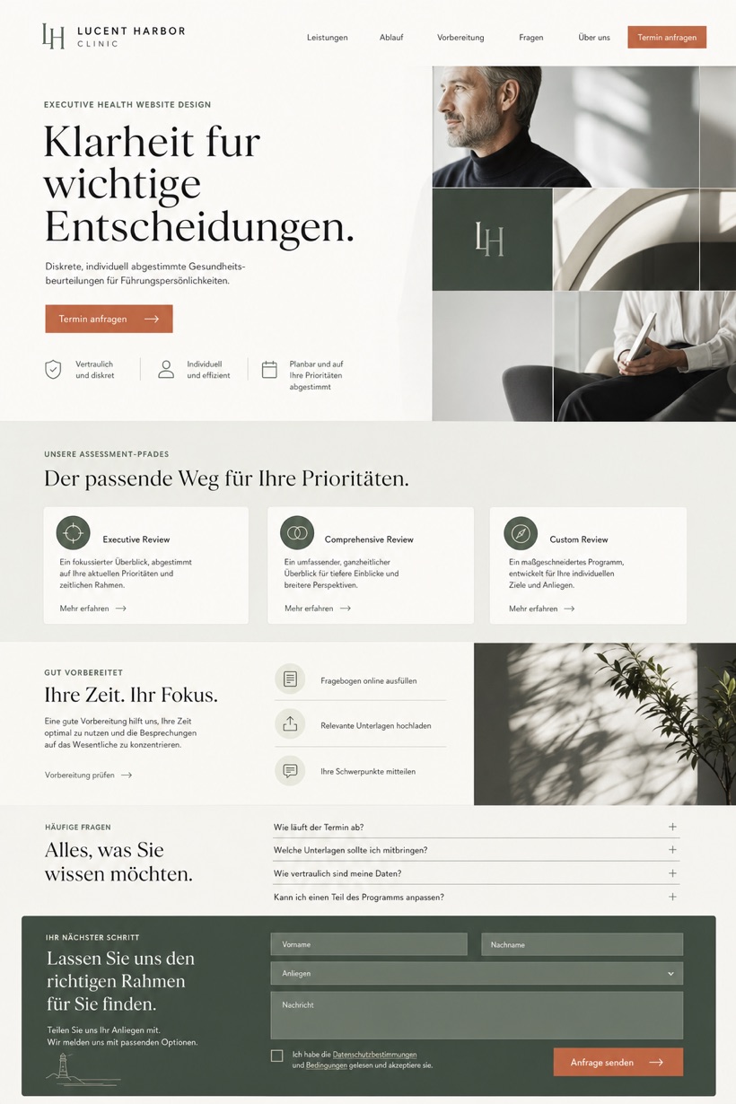
Magazine masthead creates a professional editorial tone for the clinic.
Quiet masthead presents process cards and final consultation panels clearly.
Design reading
Fictional Executive health and diagnostics website design concept for Lucent Harbor Clinic, with a clear service journey, practical information, FAQ, and inquiry path. The study uses reference showcase direction with a source derived layout structure and a quiet magazine masthead with below fold process cards and a final consultation panel opening pattern. Its white, graphite, celadon, and one warm clay action accent colour approach supports a clear reading order from context to inquiry without presenting the fictional brand as an operating business.
Independent fictional concept study; not client work or a live business.
Information and action
The notes explain the intended function of the concept rather than presenting the fictional brand as a client or live organisation.
01
Magazine masthead creates a professional editorial tone for the clinic.
02
Below-fold cards organize complex diagnostic processes into digestible steps.
03
One warm clay accent provides focused interaction targeting.
Responsive thinking
The long presentation image is a showcase artefact. A live project would be rebuilt as responsive HTML rather than served as one tall image.
Mobile / 01
Card grids reflow into single-column sequential reads.
Mobile / 02
Consistent padding ensures legible text on smaller displays.
Delivery
Content, images and actions would be separated into accessible page components, with real text and controls at every viewport.
Healthcare
Compare how the same industry can use different hierarchy, imagery and inquiry structures without repeating one template.