01
Hierarchy
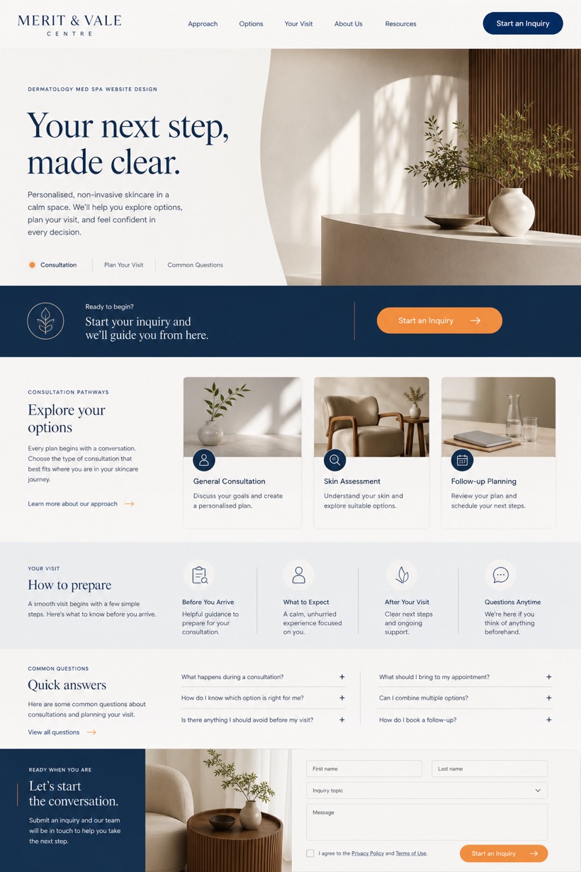
Editorial split placement pushes the call-to-action into a mid-page band.
Editorial split layout with mid-page call bands and structured med spa service grids.
Design reading
Fictional Non-invasive dermatology and med spa website design concept for Merit & Vale Centre, with a clear service journey, practical information, FAQ, and inquiry path. This reference layout positions the primary action inside a mid-page band rather than top corners. Porcelain white and mineral blue backgrounds support walnut textures. Restrained citrus markers draw focus to practice details.
Independent fictional concept study; not client work or a live business.
Information and action
The notes explain the intended function of the concept rather than presenting the fictional brand as a client or live organisation.
01
Editorial split placement pushes the call-to-action into a mid-page band.
02
Porcelain white and mineral blue tones establish a clinical aesthetic.
03
Restrained citrus markers highlight key service navigation elements clearly.
Responsive thinking
The long presentation image is a showcase artefact. A live project would be rebuilt as responsive HTML rather than served as one tall image.
Mobile / 01
Single column stacking prevents mid-page band overlap on small screens.
Mobile / 02
Fluid typography scaling maintains readability across varying device widths.
Delivery
Content, images and actions would be separated into accessible page components, with real text and controls at every viewport.
Healthcare
Compare how the same industry can use different hierarchy, imagery and inquiry structures without repeating one template.