01
Hierarchy
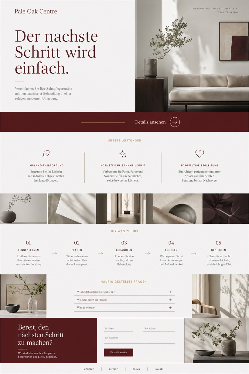
Editorial split composition balances imagery with descriptive textual panels.
Fictional dental practice showcase displaying editorial split design, service pathways, and structured inquiry flows.
Design reading
Fictional Implant and cosmetic dentistry website design concept for Pale Oak Centre, with a clear service journey, practical information, FAQ, and inquiry path. This reference-showcase concept presents an editorial split layout with the call-to-action positioned in a mid-page band, utilizing paper white and ocean grey tones alongside light brass separators.
Independent fictional concept study; not client work or a live business.
Information and action
The notes explain the intended function of the concept rather than presenting the fictional brand as a client or live organisation.
01
Editorial split composition balances imagery with descriptive textual panels.
02
Mid-page band positions calls-to-action away from standard header corners.
03
Ocean grey structures layout while oxblood emphasizes key functional elements.
Responsive thinking
The long presentation image is a showcase artefact. A live project would be rebuilt as responsive HTML rather than served as one tall image.
Mobile / 01
Single-column stacking aligns split panels vertically for mobile views.
Mobile / 02
Fluid grid systems maintain proportional spacing across varying screen widths.
Delivery
Content, images and actions would be separated into accessible page components, with real text and controls at every viewport.
Healthcare
Compare how the same industry can use different hierarchy, imagery and inquiry structures without repeating one template.