01
Hierarchy
Optical care modular styling enforces systematic component grouping and precise alignment across digital surfaces.
This fictional German vision care showcase demonstrates an optical care modular approach using asymmetric grids and intuitive service selectors.

Design reading
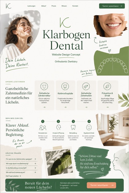
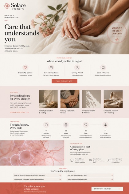
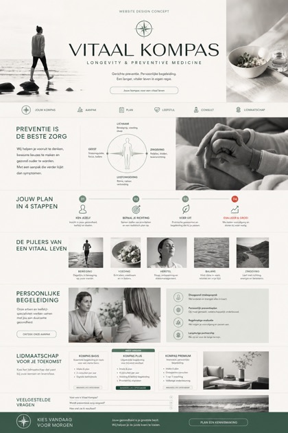
Fictional German ophthalmology and vision care website concept with optical grid, service selector, patient pathway, and FAQ. The interface applies an optical care modular philosophy utilizing optical white mistblue and apricot shades for clinical clarity. A modular eye hero introduces diagnostic categories before expanding into an asymmetric vision grid that arranges detailed patient pathway guides and standardized appointment workflows for efficient online scheduling.
Independent fictional concept study; not client work or a live business.
Information and action
The notes explain the intended function of the concept rather than presenting the fictional brand as a client or live organisation.
01
Optical care modular styling enforces systematic component grouping and precise alignment across digital surfaces.
02
Asymmetric vision grid partitions diagnostic content into dynamic columns without compromising visual balance.
03
Optical white mistblue apricot color strategy ensures maximum contrast while supporting the modular eye hero framing.
Responsive thinking
The long presentation image is a showcase artefact. A live project would be rebuilt as responsive HTML rather than served as one tall image.
Mobile / 01
Grid columns collapse sequentially on smaller screens to maintain readable text proportions and interactive element sizing.
Mobile / 02
Navigation panels shift to overlay menus to preserve content density while accommodating touch gesture inputs.
Delivery
Content, images and actions would be separated into accessible page components, with real text and controls at every viewport.
Healthcare
Compare how the same industry can use different hierarchy, imagery and inquiry structures without repeating one template.