01
Hierarchy
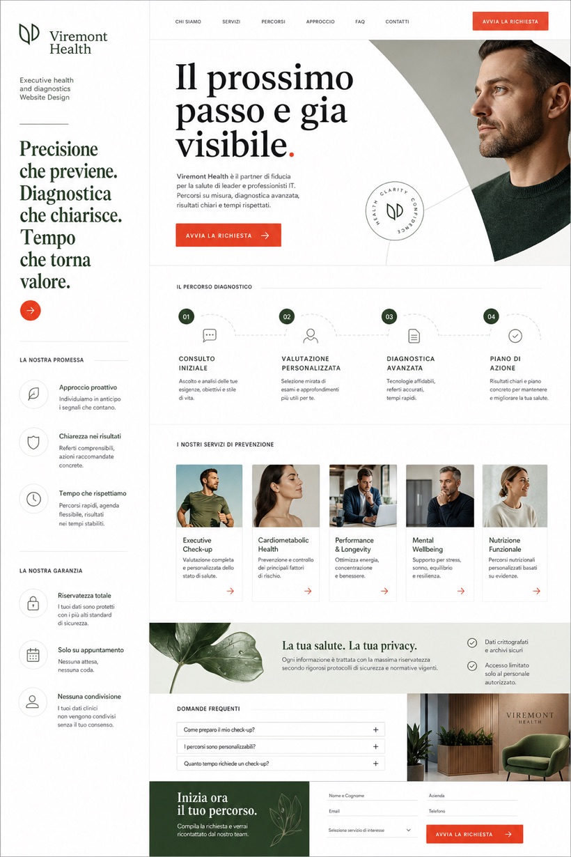
Clear white channels maximize readability across dense diagnostic descriptions.
Prominent typography leads compact diagnostic modules alongside persistent navigation tools.
Design reading
Fictional Executive health and diagnostics website design concept for Viremont Health, with a clear service journey, practical information, FAQ, and inquiry path. This framework integrates clear messaging hierarchies and compact evidence displays to streamline comprehensive wellness program discovery processes for busy professionals.
Independent fictional concept study; not client work or a live business.
Information and action
The notes explain the intended function of the concept rather than presenting the fictional brand as a client or live organisation.
01
Clear white channels maximize readability across dense diagnostic descriptions.
02
Moss gradients soften transitional areas between informational tiers naturally.
03
Soft black letterforms anchor priority headings with reliable weight.
Responsive thinking
The long presentation image is a showcase artefact. A live project would be rebuilt as responsive HTML rather than served as one tall image.
Mobile / 01
Index rails convert smoothly into collapsible accordions automatically.
Mobile / 02
Proof modules compress vertically while preserving essential metric visibility.
Delivery
Content, images and actions would be separated into accessible page components, with real text and controls at every viewport.
Healthcare
Compare how the same industry can use different hierarchy, imagery and inquiry structures without repeating one template.